
Case Study - Hop Federation

Hop Federation’s packaging had become inconsistent and they needed a system that could hold together visually while still giving each beer its own character. The new approach focused on a stronger brand structure centered around the hop icon, creating a unique visual language and labels that stand out in saturated supermarket shelves. The result lifted their presence in the market and was recognised with multiple industry packaging awards.
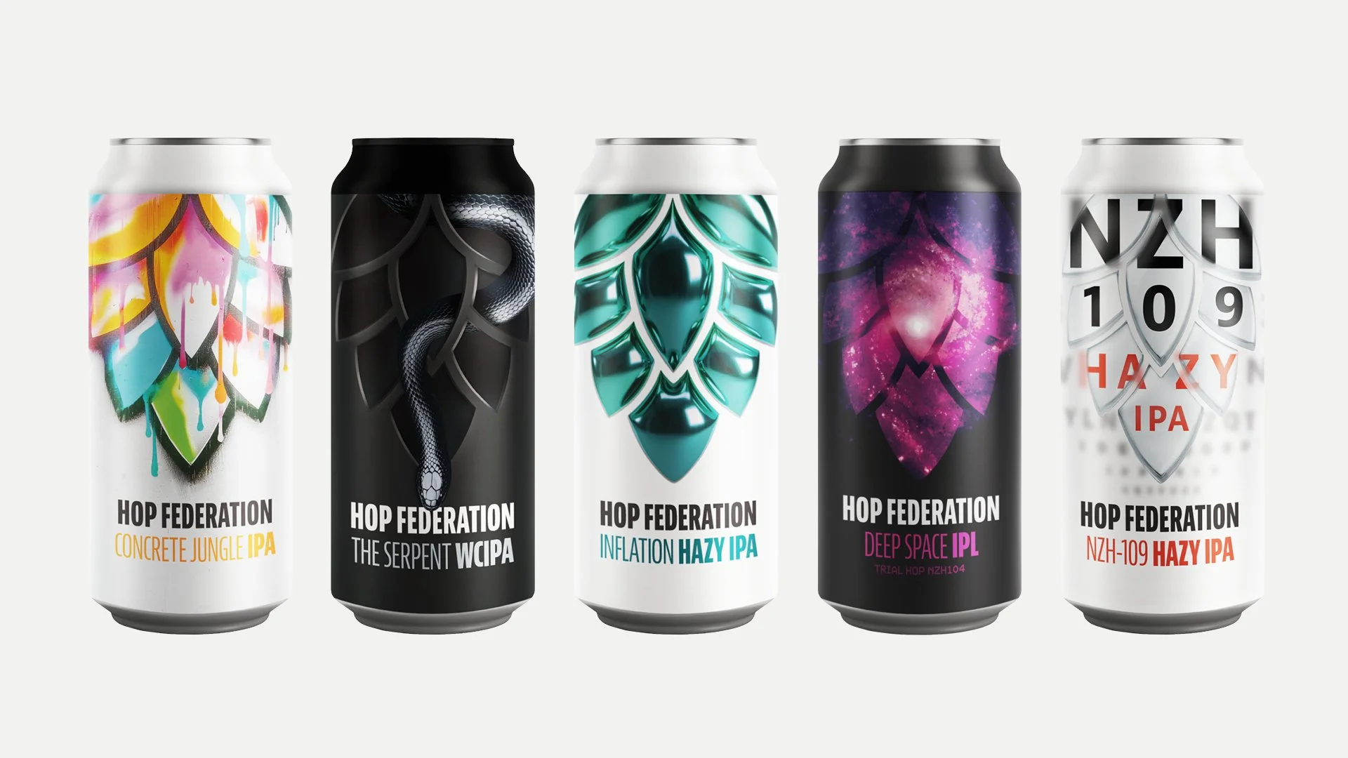

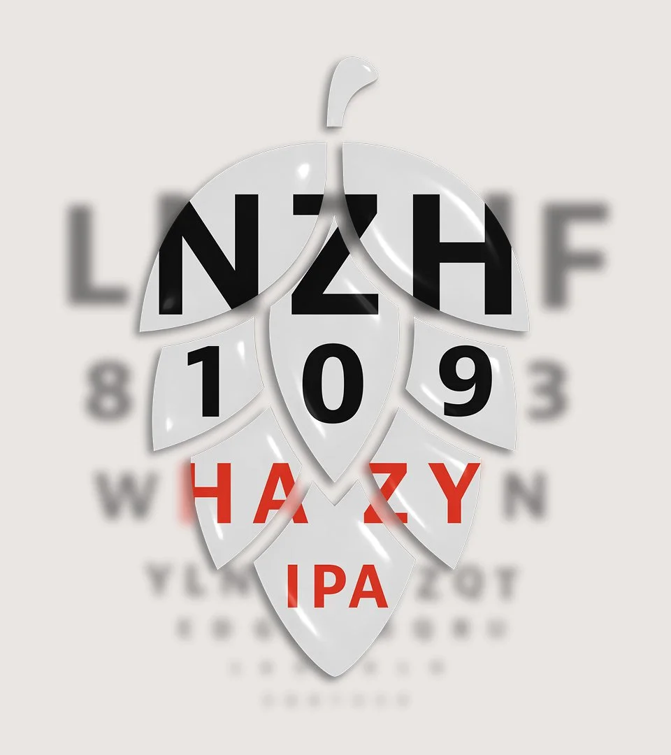
Packaging Gallery


Promotional images & social animations
